Värska Health Resort Centre
Corporate Identity
⬤ Bronze ADC* Estonia
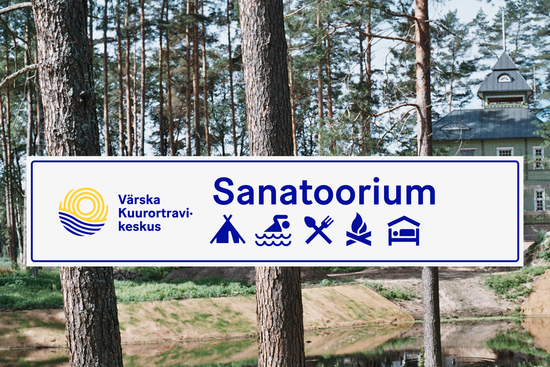
Värska is known for several good things: Excellent mineral water from 470 meters from underground, clean and species-rich nature, the pure mud from the deep bottom of Värska Bay and – the famous Värska Health Resort Centre, est. in 1980. It is located in a rural corner of South-East Estonia, surrounded by large forests, lakes and bogs.
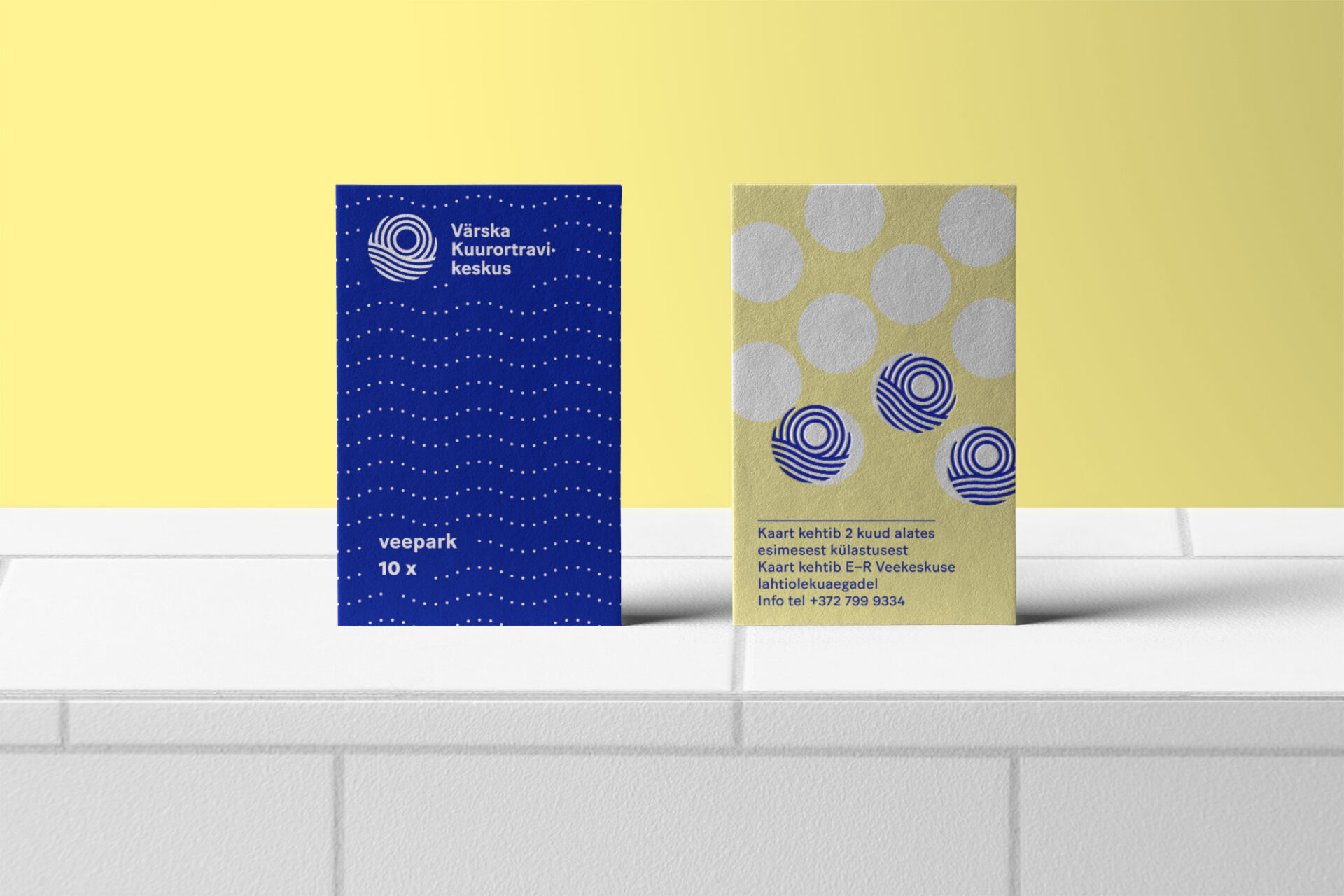
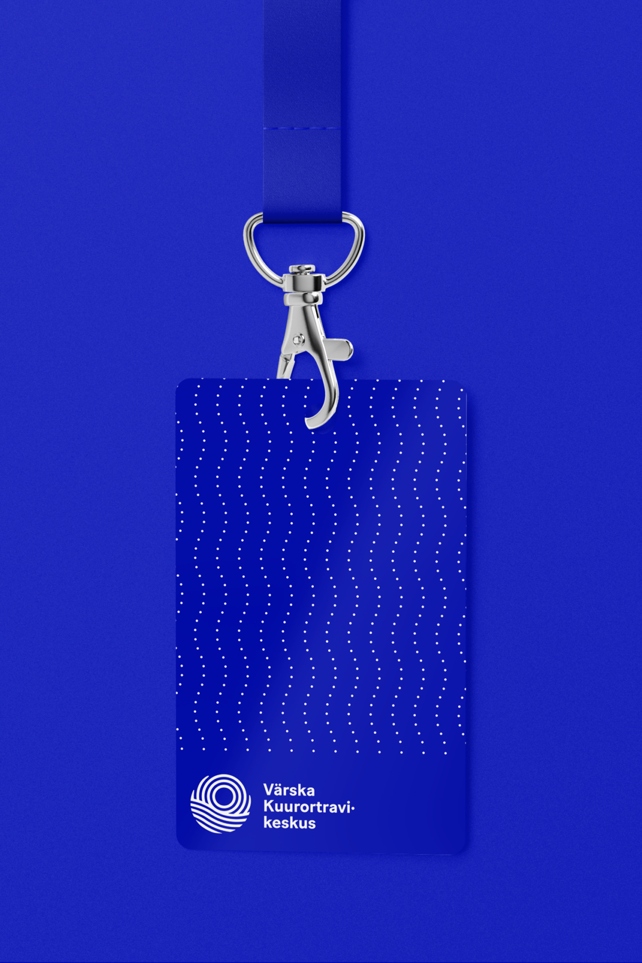
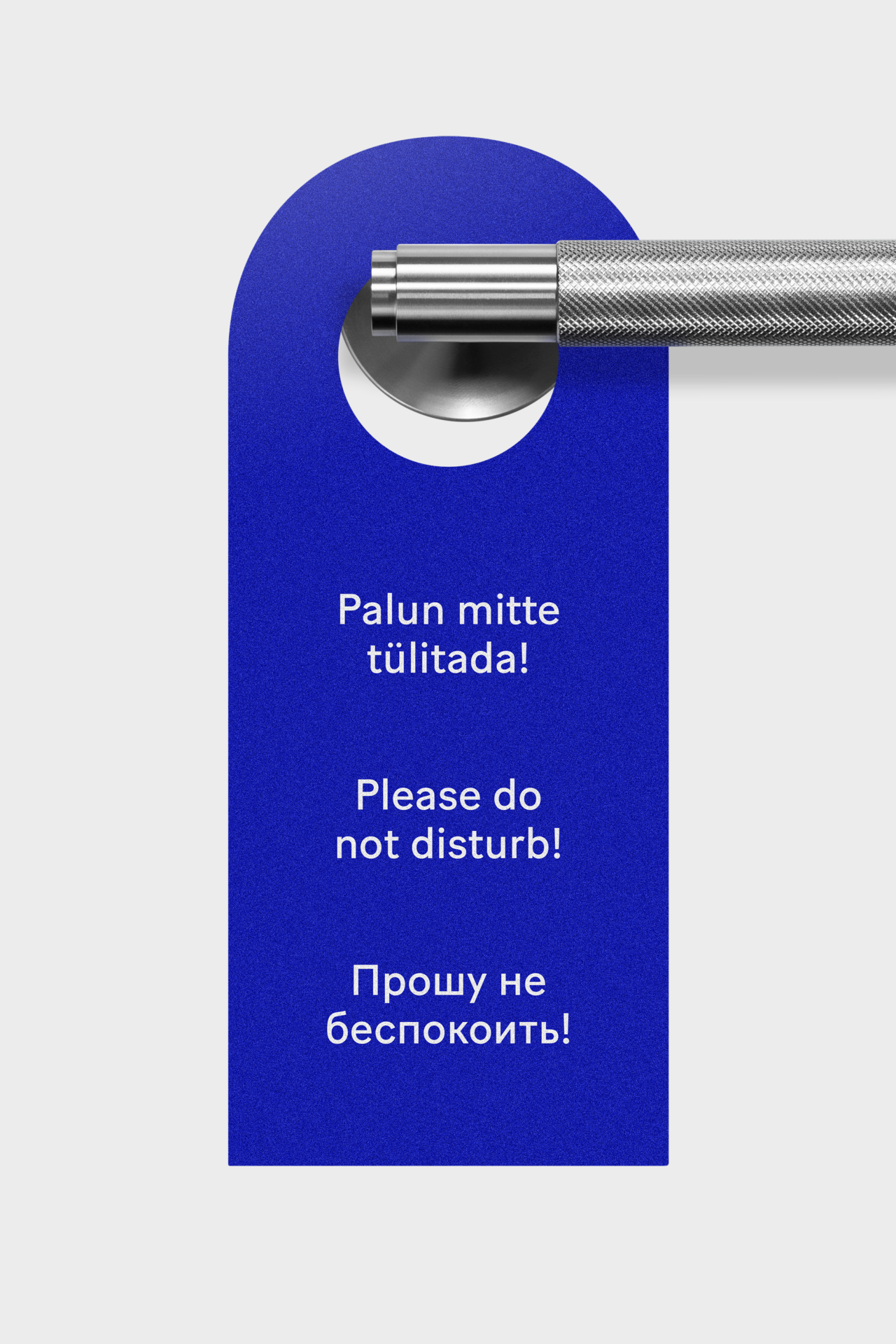
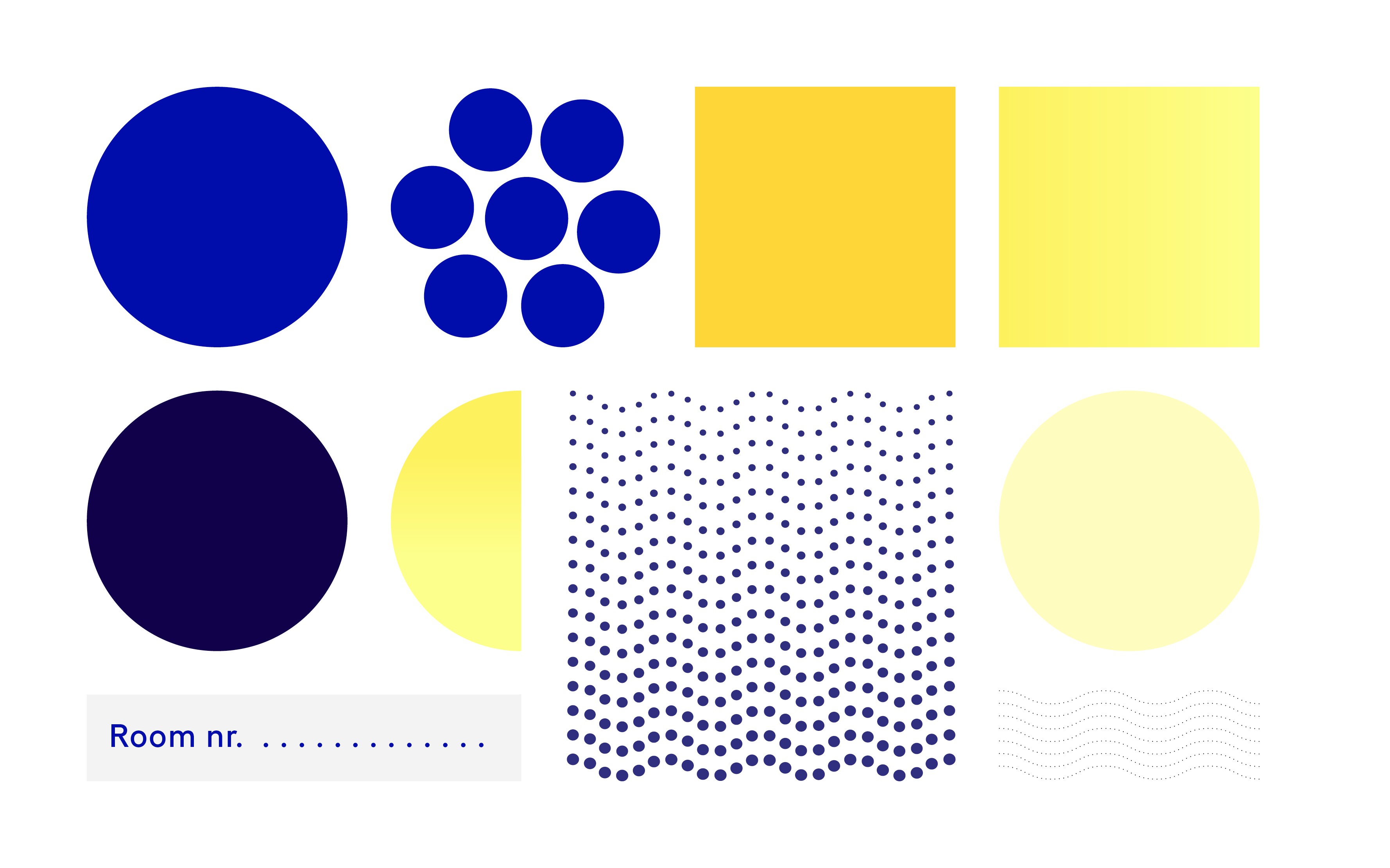
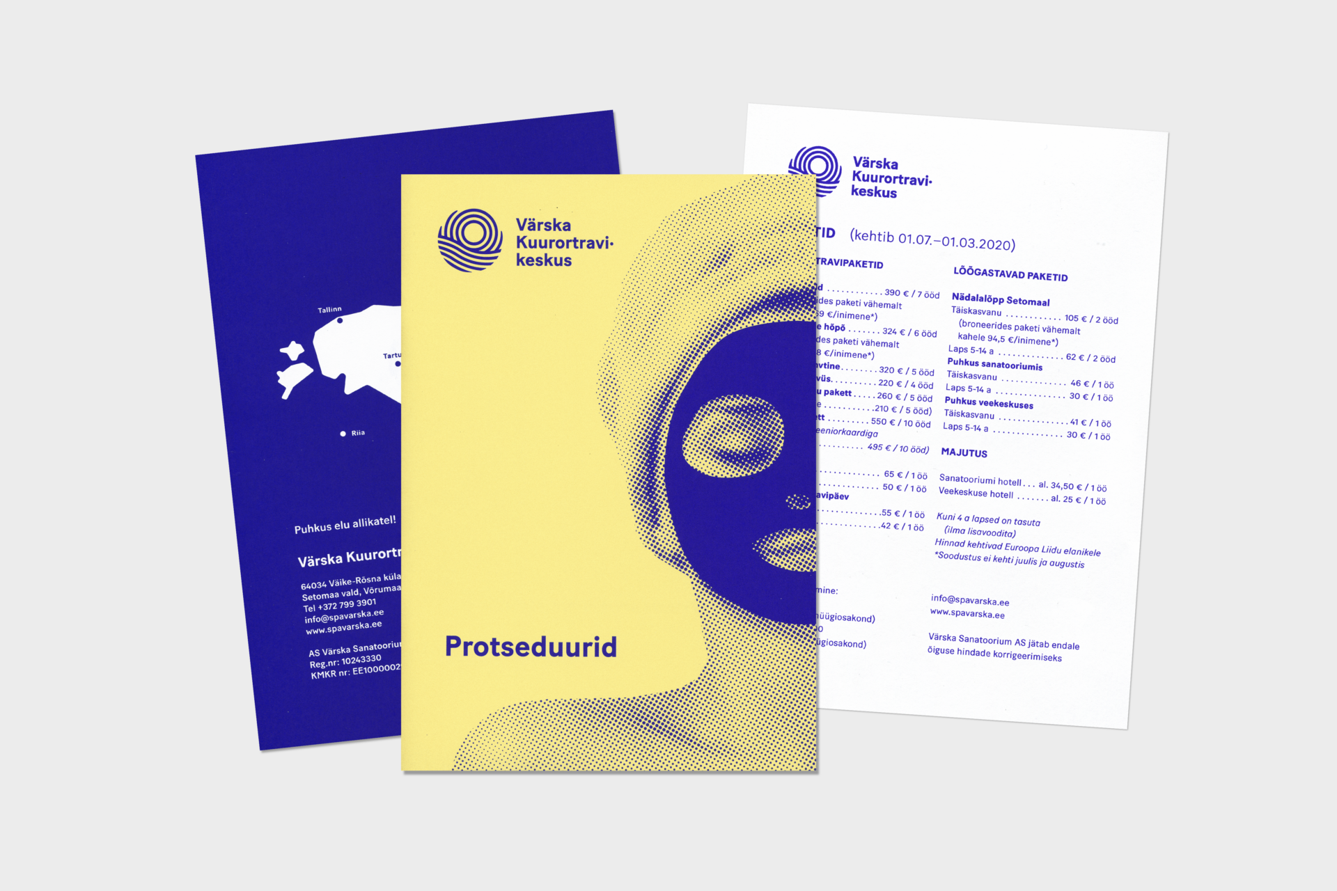
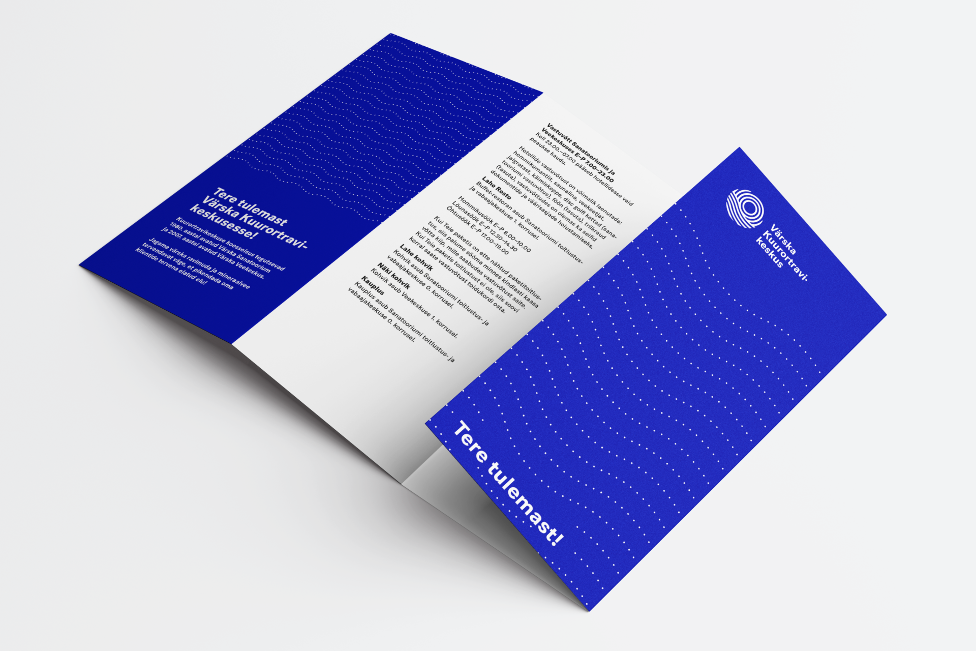
The task was to design a strong modern cohesive visual identity, using somewhat similar colours to the previous design. The resort has a sanatorium and a water park. Water and sun are the main elements in all the health-procedures, and this inspired us to use motives as water drops (the dots) and waves to create the visuals.
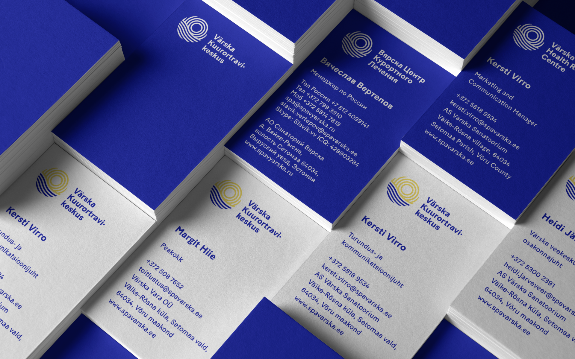
The logo had to be modular because of multilingual use, also in vertical and horizontal alignment. Among other alternative versions, Värska got a short conclusive logo for the area – Värska Resort (Värska Kuurort in Estonian).
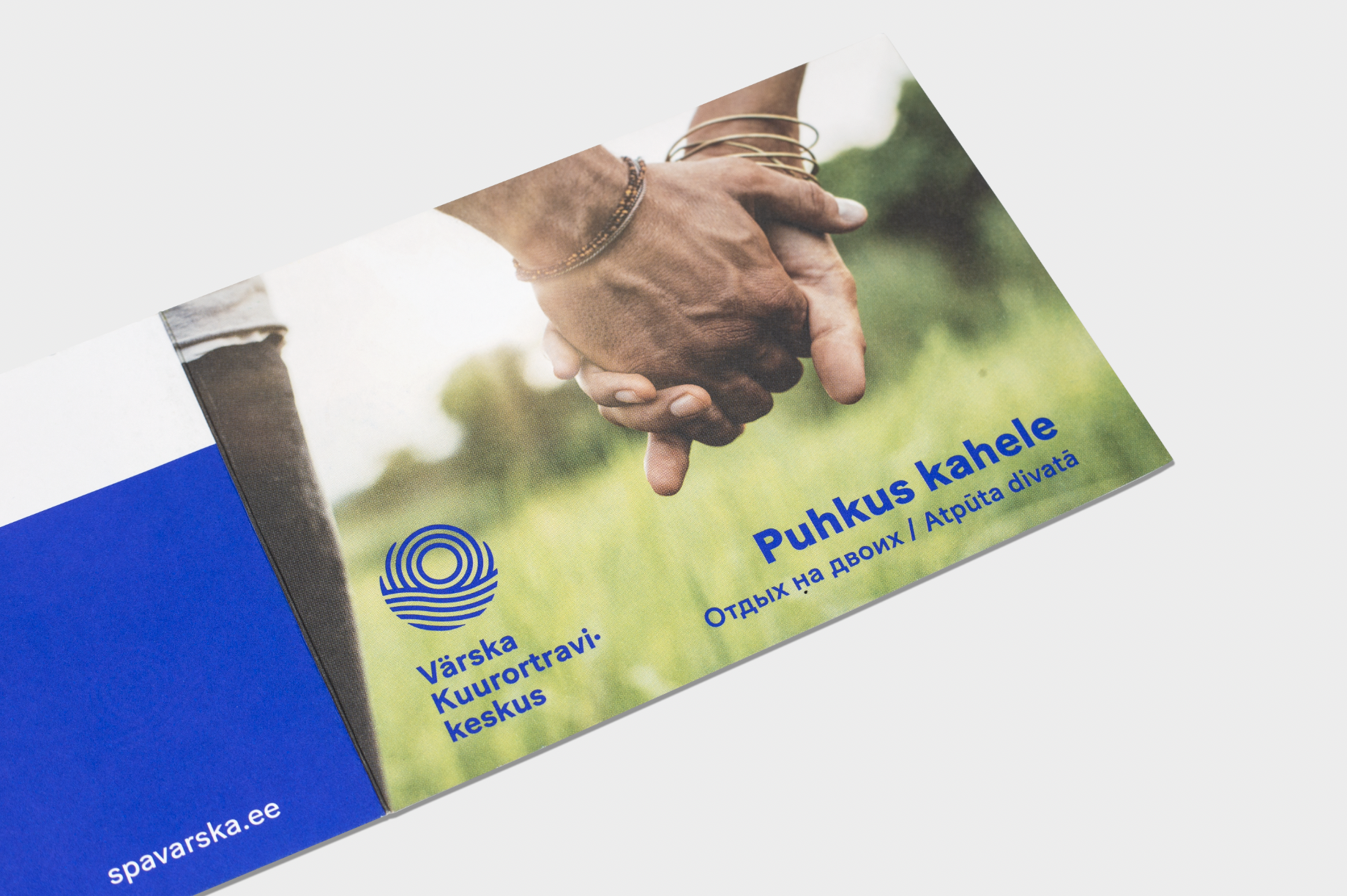
Photos: Grethe Rõõm, Jaan Rõõmus
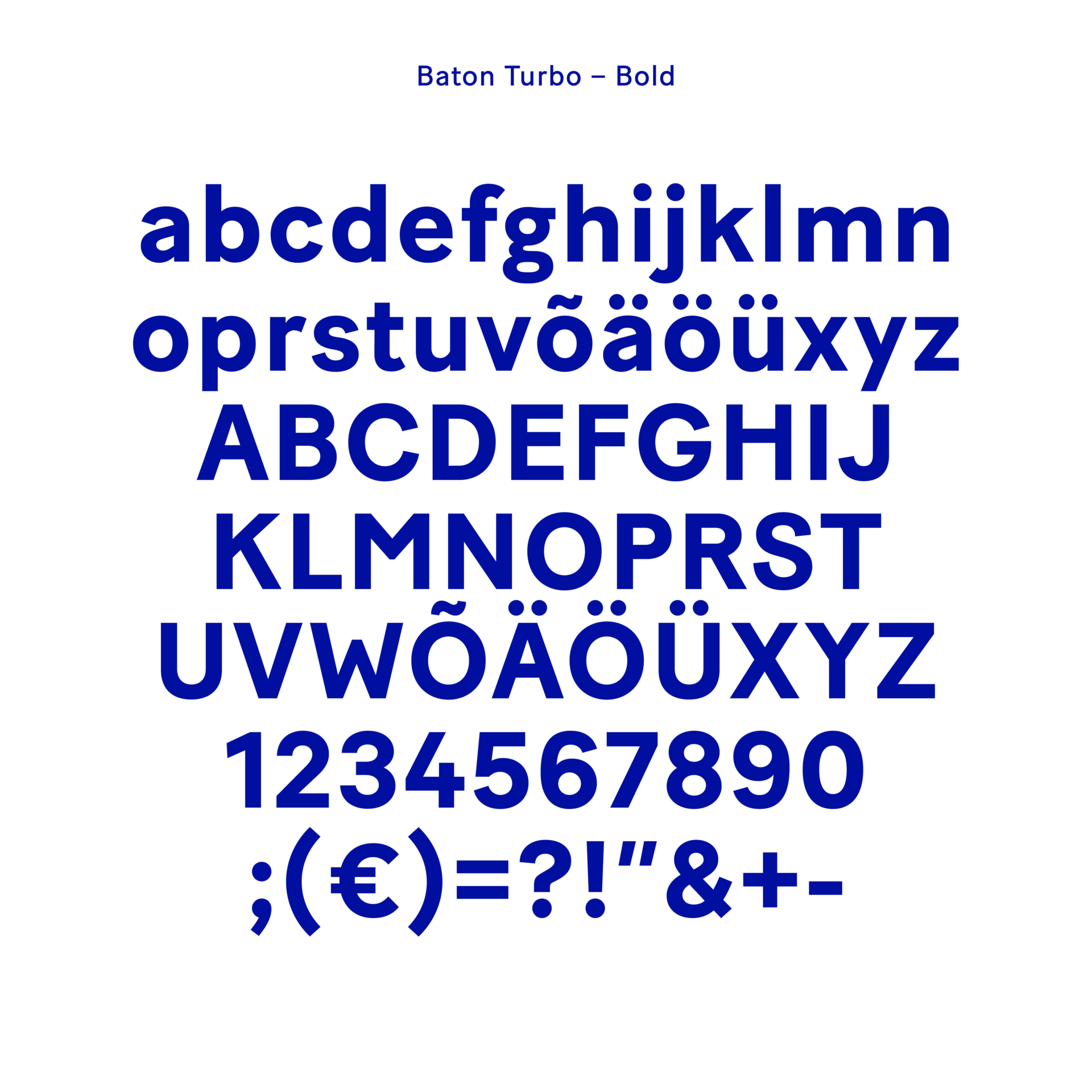
Typeface
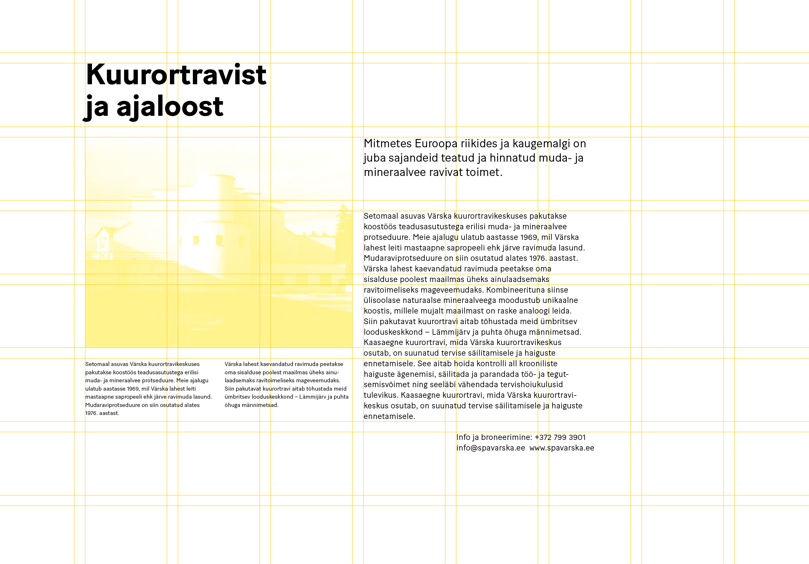
We paid the most attention to the typeface – Baton Turbo family created by Fatype. It has a wide range of styles and also very importantly – a proper Cyrillic alphabet. The typeface needs to look good to use on paper and on screen. Baton offers just that: the modern proportions (higher x-height, low contrast, and good rhythm). The paper for most of the prints is Munken Lynx, as it has high quality, a good natural white tone, and enough thickness from business cards to folders.


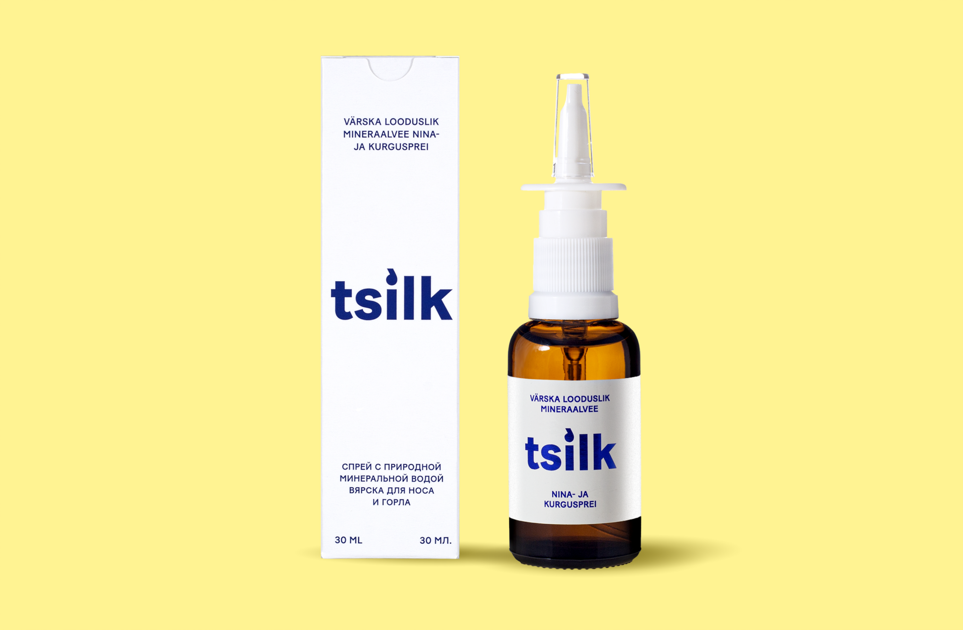
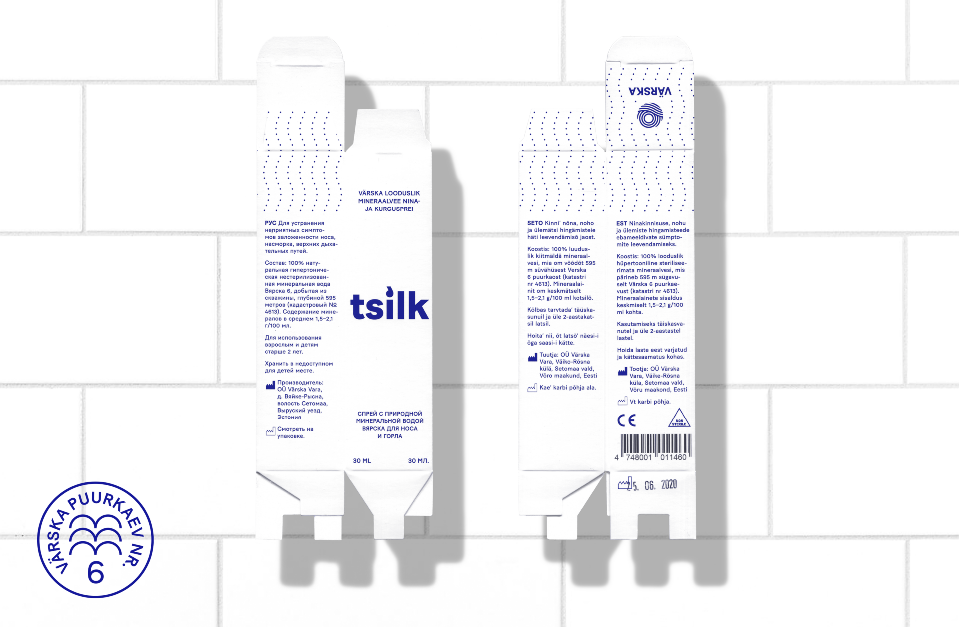
Tsilk
In Seto dialect, Tsilk means drop. Tsilk is a natural nose-spray with no chemicals, prevention, and a remedy against the cold or sorrow throat. In the design concept for Tsilk, we found a suitable aesthetic and scientific form for it, distinguishing it as a medical good from any cosmetics.

© Jangel 2025